Dates: 2023–2025
Type: Utility • B2C
Market: Worldwide
MAU: 5M
Role: Design lead, Senior product designer
Responsibilities: Design mgmt • Product design • Design system
Aloha is a privacy-focused browser with 5M MAU, primarily for mobile, and recently expanded to desktop.
At Aloha, I worked on key browser features, simplifying complex privacy tools for everyday users. Growth initiatives I led significantly boosted engagement and retention.
As a design team lead, I directed the major project of Aloha’s new look & feel. I also optimized routines, freeing up team time for more creative and valuable tasks. By focusing on team atmosphere and growth tracks, I helped the design team become more capable and mature.


Aloha had a fresh and playful design, but we had concerns about its positioning.
Aloha is a casual yet secure tool — not a kids’ app.
We wanted to keep the ocean vibe, but in a more subtle way.
75% of our audience is male.
70% of users prefer the dark theme.
The browser serves as a frame for the content.
The new design was developed entirely in-house, from briefing to validation. I managed the project and provided art direction, working closely with two mid-level designers — a web designer and a graphic designer.
To validate our concept, we conducted multiple research studies with Aloha users and external participants.
75% of Aloha users said they would like to see the app in a new design.

After the release, first-day retention increased from 23% to 26%.
We also received a lot of positive feedback from users about the new look and feel.
While working on the new menu, we had a few goals:
Make the interface scalable for adding new features
Organize functions based on their frequency of use
Group functions by context to make navigation easier
Add a new feature — Website options — allowing users to set specific settings for individual websites
As a result, we created a scalable menu where each function is placed according to its popularity and usage context. It’s now easy to add new features to any part of the menu.
Website appearance controls like Read Mode and Desktop Version are grouped together and presented as switches, making active options easy to see.
Advanced users can also configure site-specific settings.
Users with the new menu showed higher retention.
Half-screen menu

Full-height menu
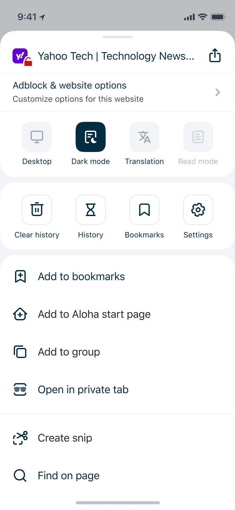
Website options

I started by analyzing the current usage of the website menu through analytics and gathering references from other utility apps. Then we validated the concepts through UX testing and refined the design.
The initial solution wasn’t perfect, so after launch we used analytics, user requests, and team feedback to refine and release an improved version.
The previous onboarding didn’t fulfill its purpose, it lacked:
Clear explanation of key features
Personalization
User activation
Communication of value
Moreover, there was a Skip button, and 74% of users skipped the onboarding from the first step.
I proposed a complete onboarding redesign to make it more valuable for both users and the business.
All key features like VPN, Downloads, and Adblock were presented using interactive screens.
In addition, users can now customize their browser and build a stronger connection with the product. The final screen summarizes all key values and includes an important action for us — “Set Aloha as Default.”


The new onboarding significantly improved key metrics:
10%
35%
14%
To achieve this result, we went through 3 iterations of the onboarding flow. By working closely with the product manager and marketing team, we refined the set of screens, texts, and visuals, and measured the metrics.
I believe onboarding is an ongoing process that should be continuously improved, but so far, we’ve achieved strong results.
Previously, all appearance settings were combined in a single list: general appearance settings and specific Start Page settings. I took the initiative to separate these settings and create a scalable interface architecture to support future extensions.
In addition, we aimed to add the ability to choose the search bar position: either at the top or bottom.
Users who personalize their experience by choosing themes and wallpapers show higher retention.
General appearance settings

Start page appearance settings

Aloha start page

1.
2.
3.
I considered different ways of organizing the settings. To choose the most intuitive structure, I conducted a card-sorting study to see where people would expect to find specific settings.
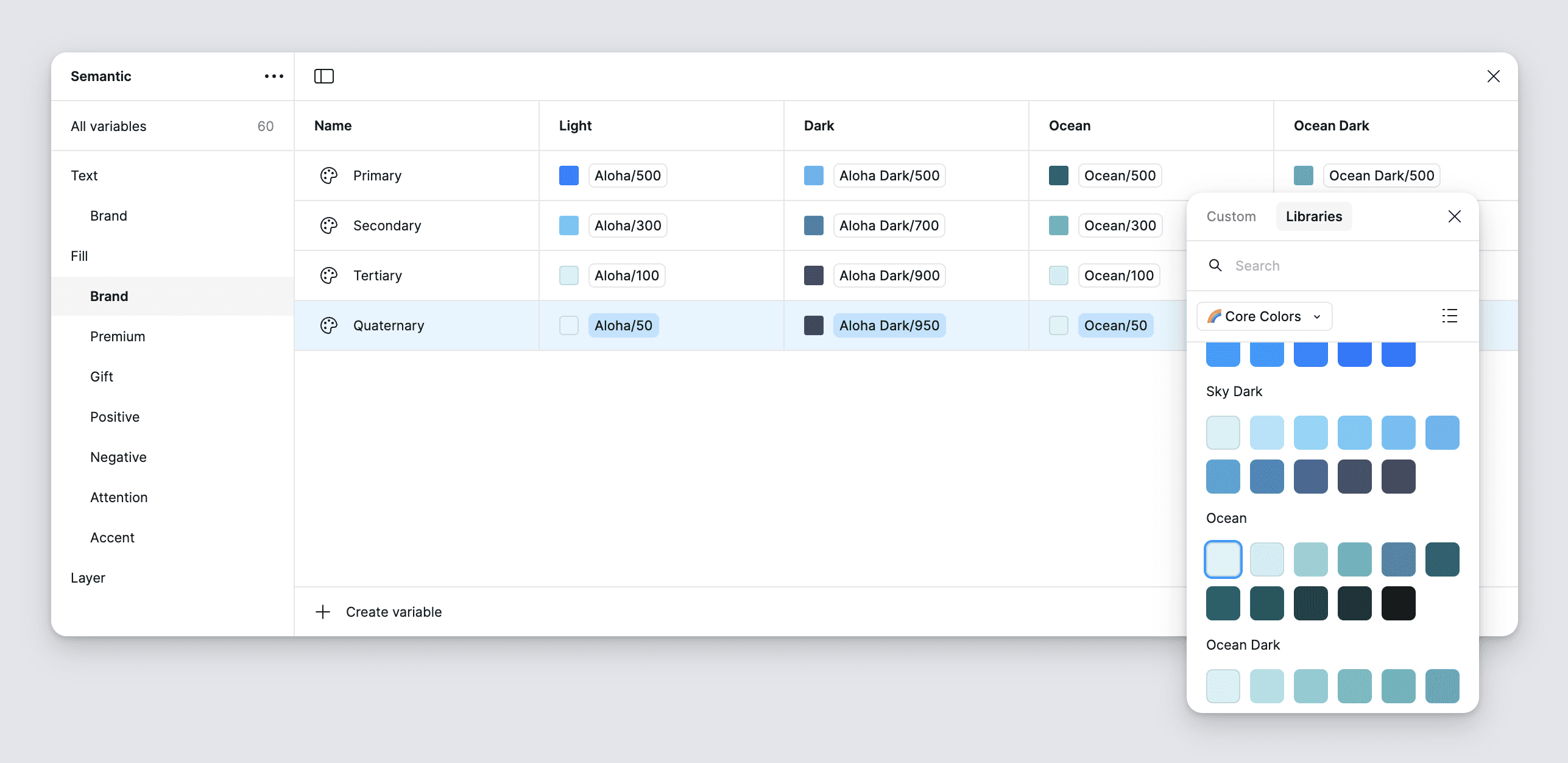
When I joined Aloha, I led the shift to a new color token architecture using Figma variables. The semantic color library was simple, scalable, and supported both light and dark modes, along with six color themes.
In close collaboration with developers, we built a tool for automatically importing color tokens from Figma into the code using the Figma API.
You can find more details about this case in my articles, which have been appreciated by thousands of designers around the world.
1.
The semantic color library built with Figma variables saved a significant amount of time previously spent on manually creating dark mode designs
2.
Automatic color export from Figma to code made changes easier and more accurate
3.
Several accessibility, consistency, and elevation hierarchy issues were fixed with the new color architecture
For our new website, we decided to build a new design system fully based on Figma variables to support different modes. I led the project, while my mid-level colleague was responsible for implementing the solution.

In addition to the similar color architecture we already had in the product, we introduced tokens for sizes, spacing, padding, and fonts. This allowed us to use Figma modes and automatically adapt components for different screen resolutions.
1.
Supporting different screen size modes for components boosted the design delivery
2.
The end-to-end design system in Figma and code decreased time to market and reduced the number of mistakes