Dates: 2020–2022
Type: e-commerce platform • B2С
Market: Worldwide
Role: Product designer • Design system manager
Responsibilities: Product design • Growth experiments • Design system
Ecwid is an online store builder that enables merchants without technical skills to launch their store in an hour.
More than 2 million online stores have been built with Ecwid worldwide. Since 2021, Ecwid has been part of the Lightspeed Commerce group.
At Ecwid, I started as a product designer. Later, I led several design system initiatives and worked in a growth team.
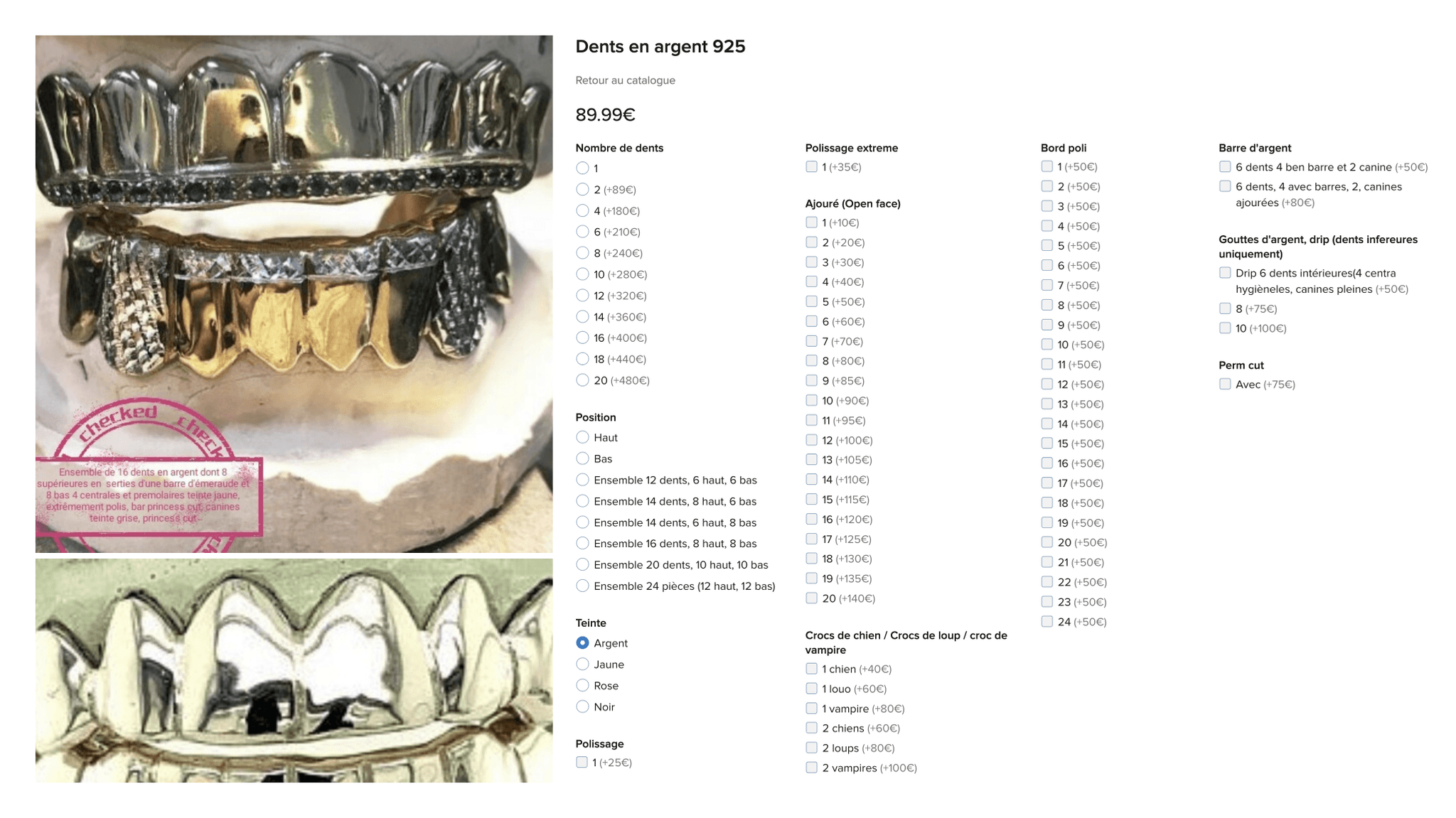
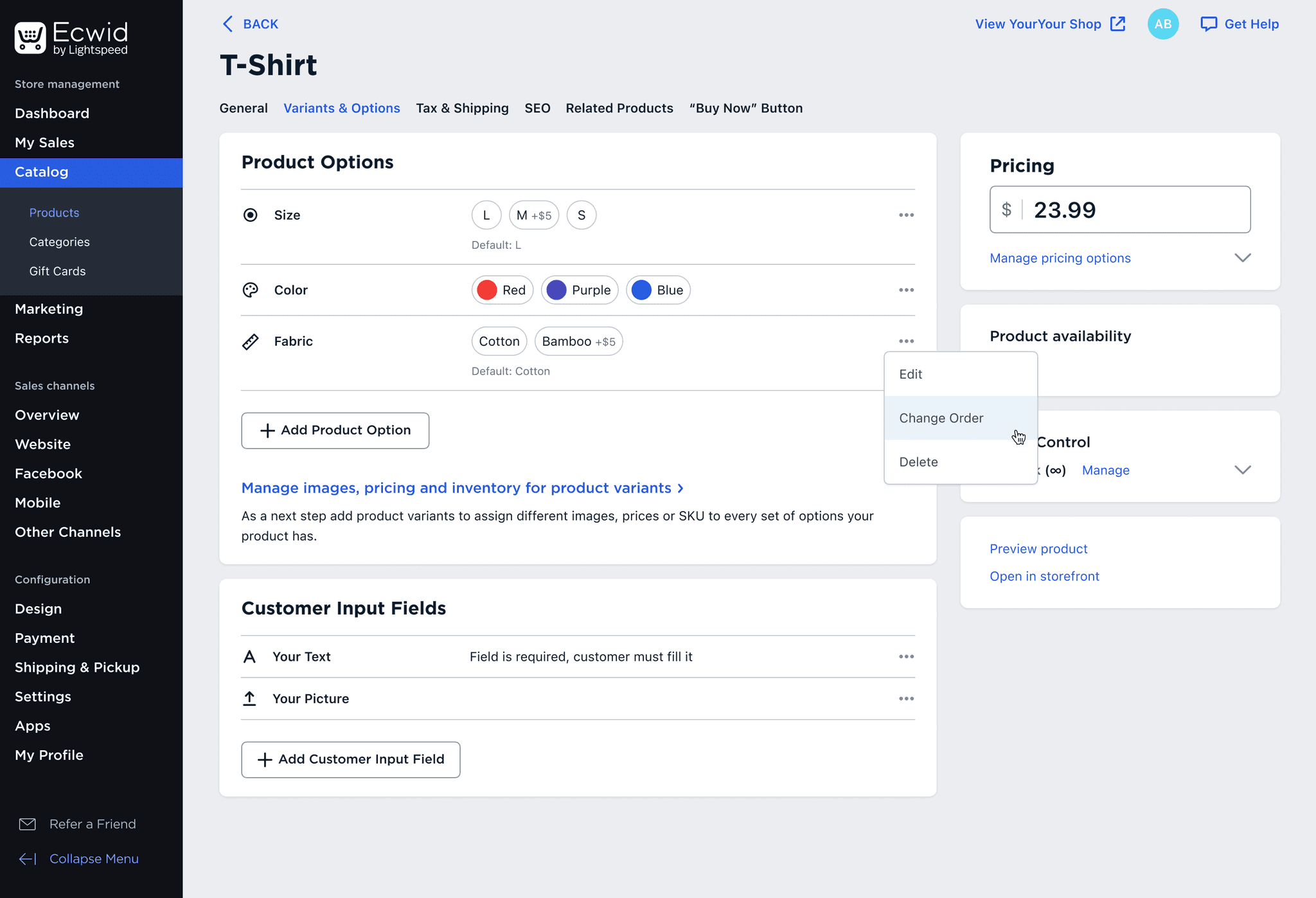
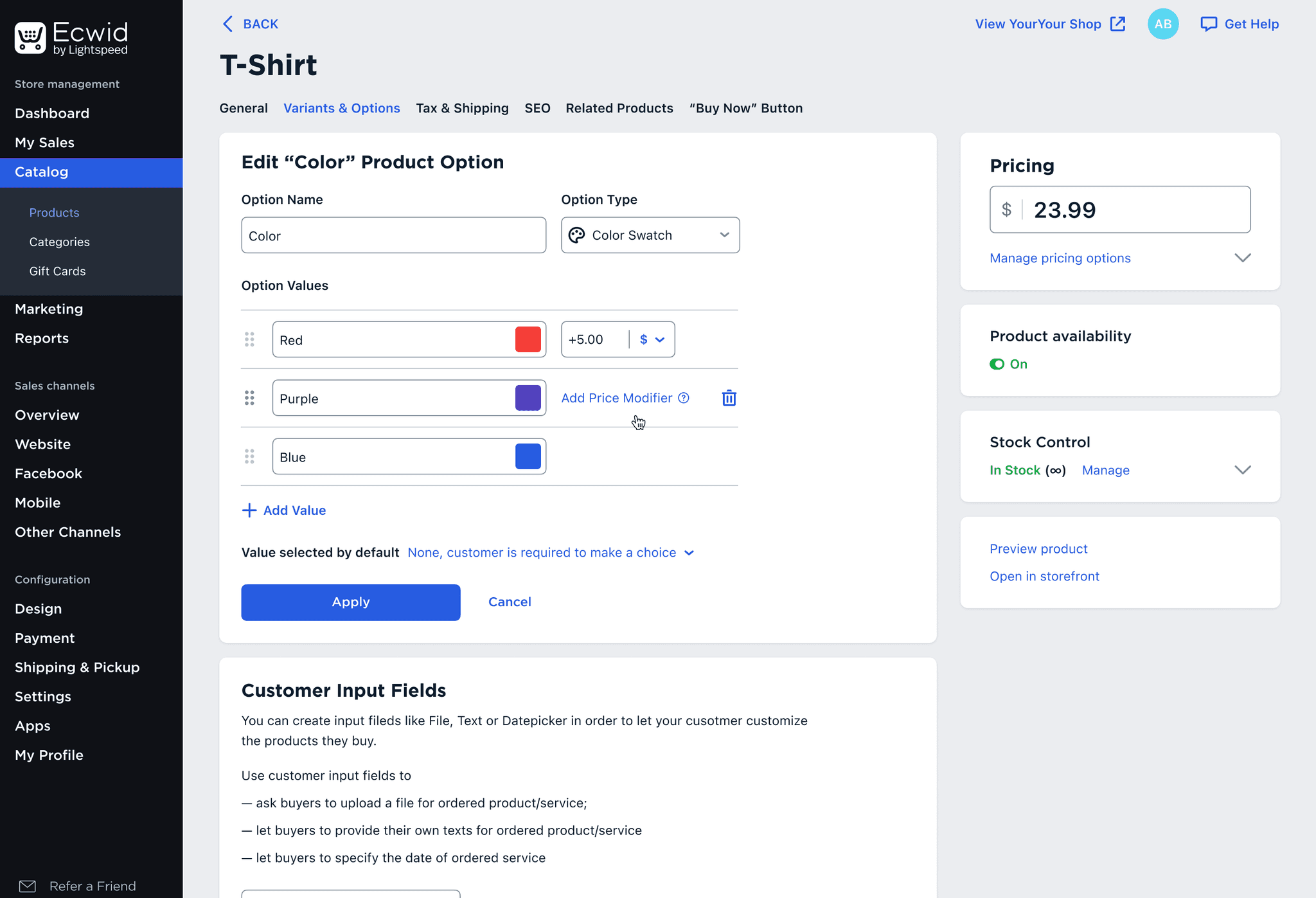
Product Options is one of the most interesting and challenging features I worked on at Ecwid. Merchants use them to add choices like colors, sizes, or extras to their products.
The interface for this important feature was outdated and confusing. Users struggled with it and spent too much time adding options to their products.
Key metrics:
Time spent adding options
User effort score
Feature adoption
Product Options is one of the most complex features in Ecwid, with dozens of settings. We needed a clear plan for how to "eat the whale one bite at a time."
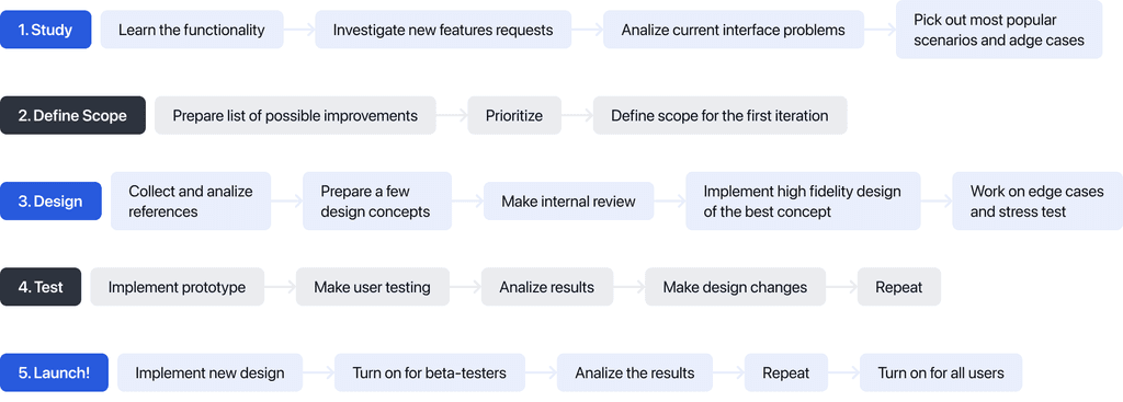
In order to improve the interface we need to understand what the product options actually are. I used several sources of data to build the full picture:
Built the scheme of the existing functionality with all actions and properties;
Analyzed user requests related to the product options feature;
Looked through the user test session videos made by my colleagues before;
Collected analytical data about most popular and edge cases;
Collected list of stores with edge cases.
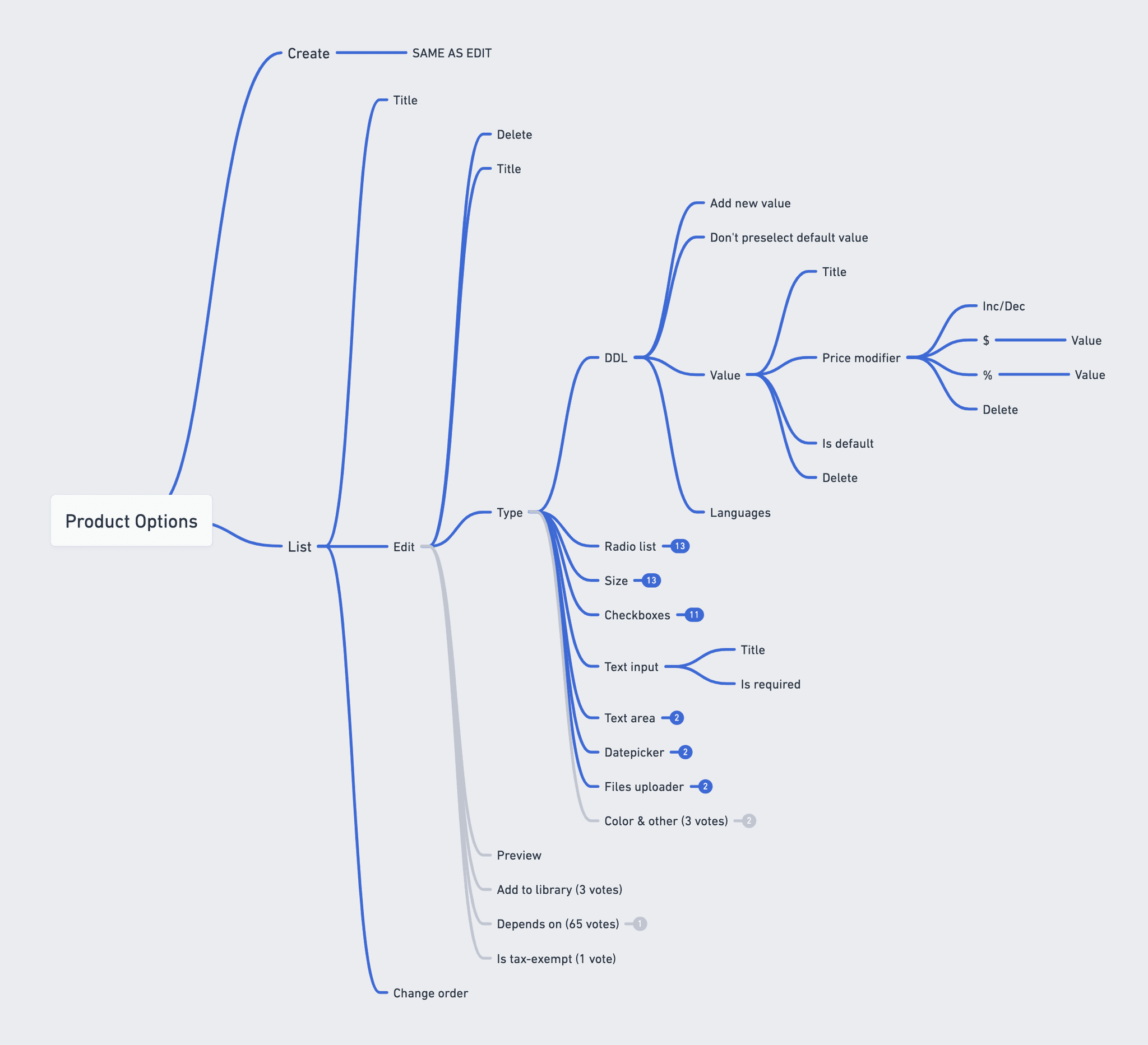
Options & values
Price modifiers

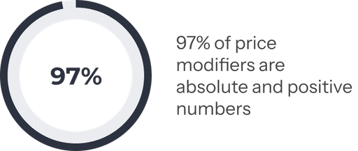
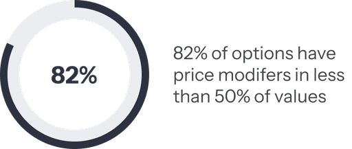
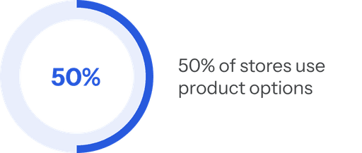
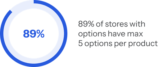
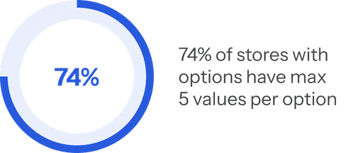
Most of merchants don't have a big number of options and values, but it doesn't mean that we shouldn't manage the edge cases.
The product options feature is not new in online store builders. I analyzed the interfaces offered by both our direct competitors (e-commerce platforms) and secondary ones (marketplaces). While exploring these interfaces, I focused on the following details:
What is the user's ultimate goal
How easy the interface look
How efficiently a user can solve a task
What interface patterns are the most popular
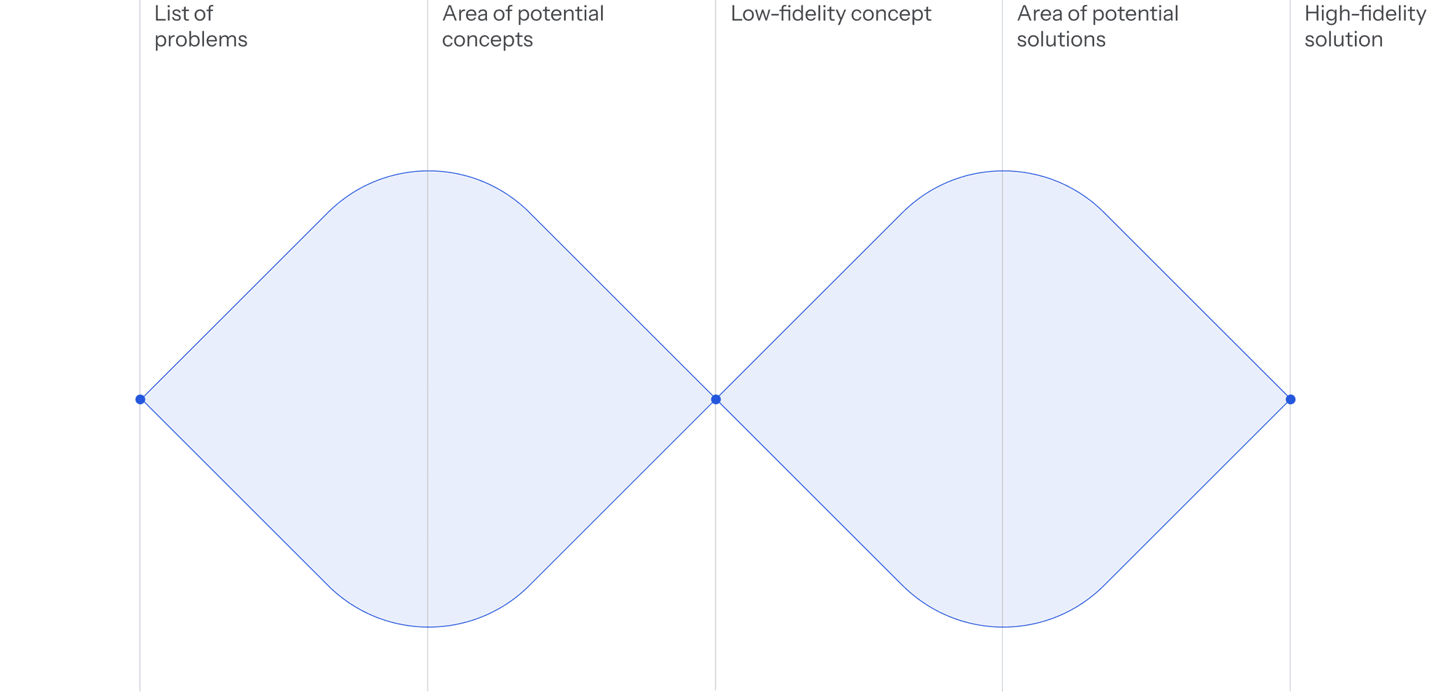
There are always multiple ways to solve the same task. I like to begin with several distinct low-fidelity concepts, then narrow them down by discarding the less elegant solutions. Once a direction is chosen, I focus on refining the details — often exploring different approaches to find the best one.
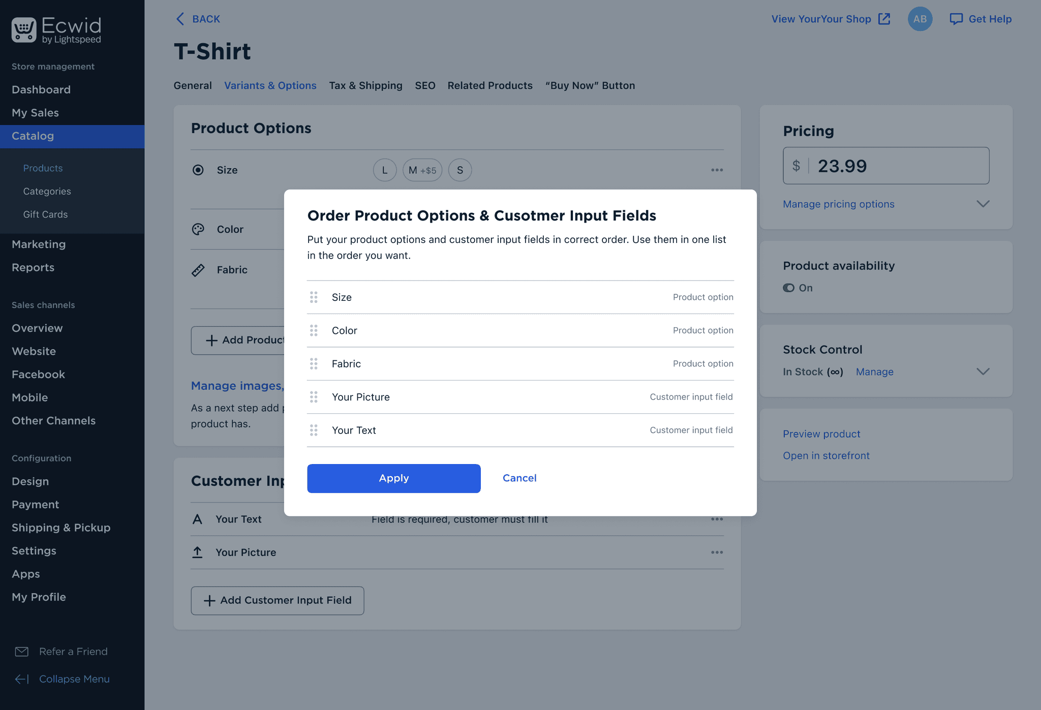
Despite the feature’s complexity, the list of product options looks clean and simple. Product options and customer input fields are now separated into two distinct sections.
However, users can still sort different product attributes within a single list to display them in any desired order on the product page.
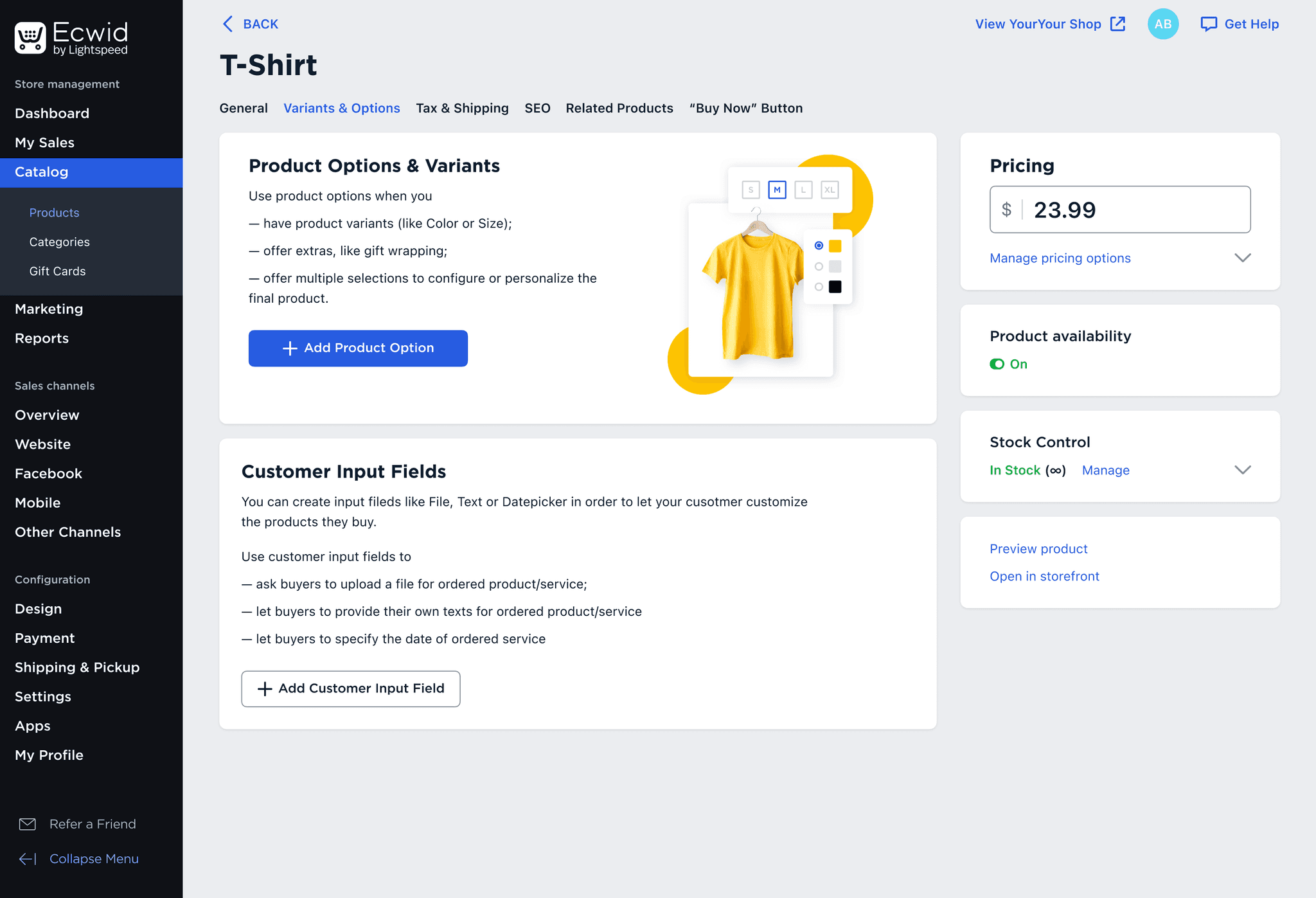
To help new merchants start using product options, we added a prominent entry point with a clear feature explanation.
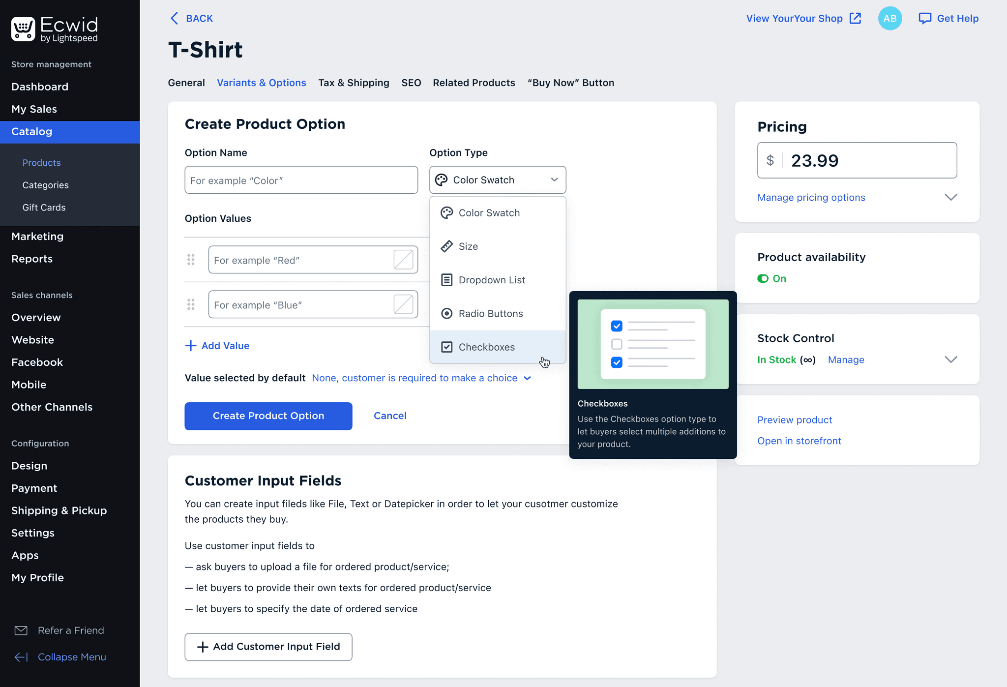
When merchants create new product options, they can choose an option type. A tooltip with a preview helps them understand how the option will appear on the product page.
The list of option values supports keyboard shortcuts, saving time for users. Price modifiers can be added for options with different prices.
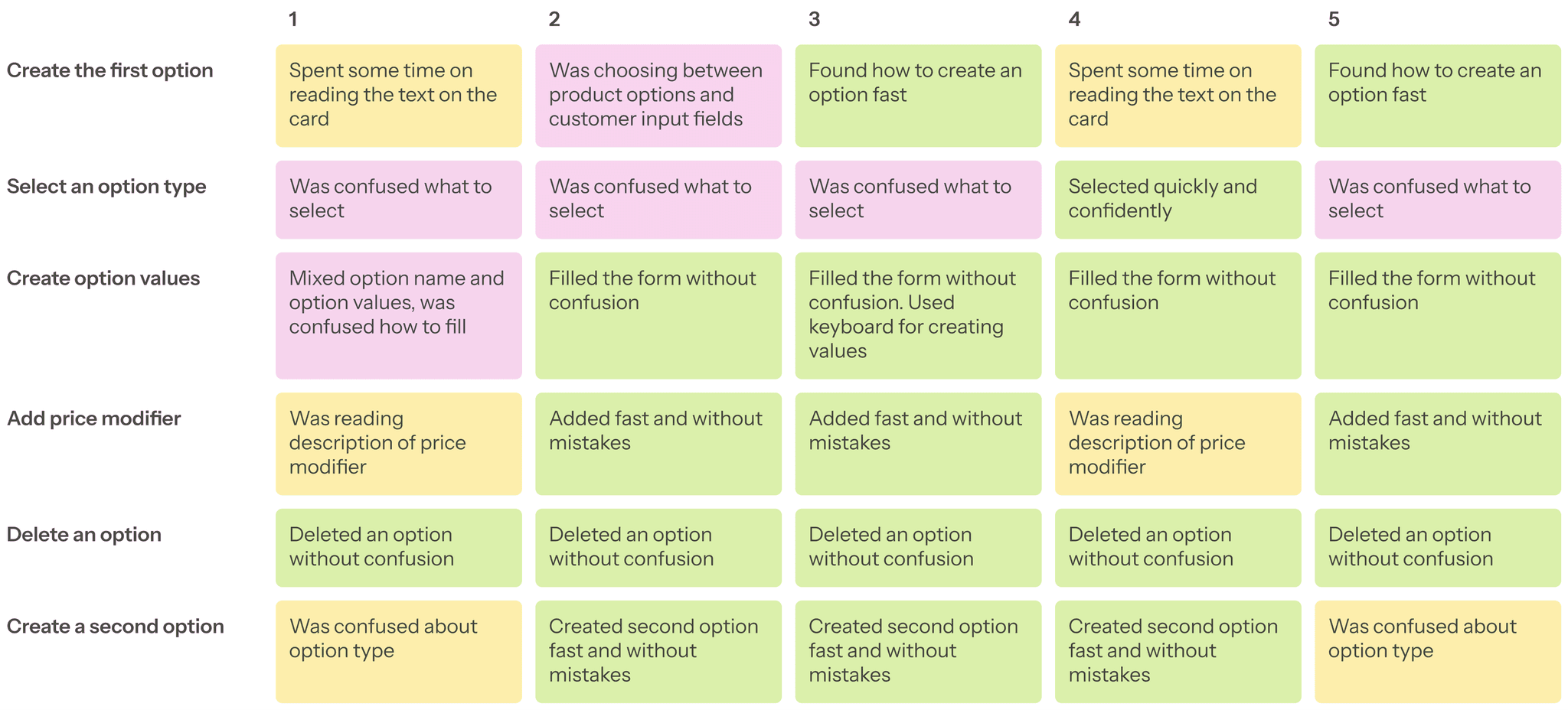
Insights from the testing sessions helped refine the final solution and led to positive user feedback and improved UX metrics.
While working on the Ecwid growth team, we launched dozens of A/B tests to improve the FTU (First Time User) metric, which increased by 60% over time.
In addition to running small experiments, we also led a major, successful initiative: Linkup — a link-in-bio product built on Ecwid’s architecture.
Linkup started as a small startup and was built in just three months. Now it’s part of the Lightspeed product family.
While managing the design system team, I led three major initiatives:
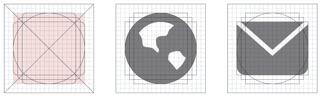
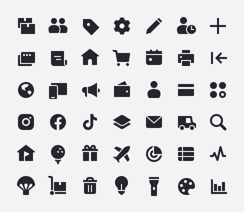
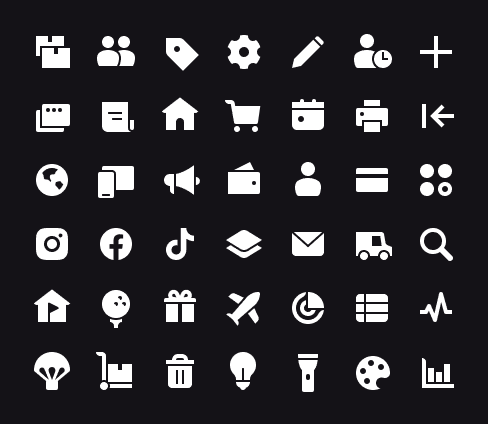
At Ecwid was my first time when I started professionally work on interface icons. We had to develop a new icons style and spread it within all Lightspeed products. I took initiative to lead this project.
I proposed a style that aligned well with the Lightspeed logo, and it was well received by stakeholders.

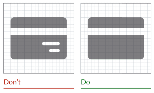
A small set of icons was carefully designed to match the pixel grid and visual weight guidelines.
I also created a style and technical guide to ensure consistency across all future icons.
Afterward, I mentored designers from different teams, reviewed their work, and supported them in creating icons for their own projects. In total, we produced over 200 new icons.
You can find more details about this case in my articles.
A new icon style was developed, along with structured guidelines
A pack of 200+ icons was created and implemented across Lightspeed products
Knowledge of icon design and the specific Lightspeed style was shared with dozens of designers