Dates: 2022–2023
Type: Travel tech • B2C
MAU: 30M
Market: Russia
Role: Senior product designer
Responsibilities: Product design • Design system
Tutu is a large travel aggregator with 30M monthly active users.
The service lets users book hotels, flights and tickets for trains and buses. I was responsible for the design of the personal user account — the final step in the customer journey. Worked closely with other teams to ensure a seamless and consistent experience across all booking types: hotels, flights, trains, and buses.
Our current Order Details page generated a high number of help desk calls:
Users struggled to find key booking details
Payment and especially refund information was unclear
It wasn’t possible to change order details online
Key metrics:
Support tickets per user
Upsell conversion
Cross-sell conversion
To organize the information on the page, I collaborated with the team to define a list of user jobs. We then prioritized them based on quantitative and qualitative research, as well as business goals.
Stay informed about booking details and changes
Access tickets and reservations, add‑ons, online check-in
View payment details & refund terms
Make changes or request a refund
Book a hotel, buy insurance or an express ticket
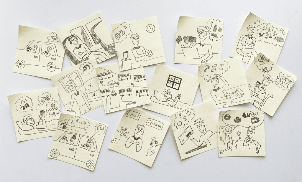
To think out of border of the Order details page interface we built the CJM which covers all the steps of the users journey, even the steps which don't include direct interaction with the Tutu app.
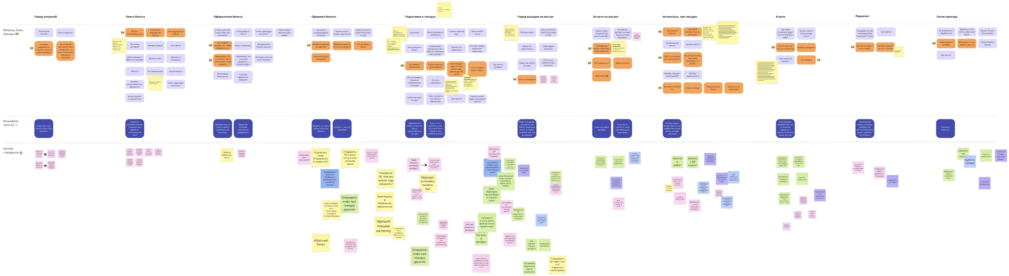
To truly understand the user’s context and feelings, I decided to add comics to the CJM. I detail this approach in my article Empathetic Insights: The Power of Comics in CJM.
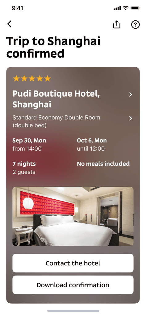
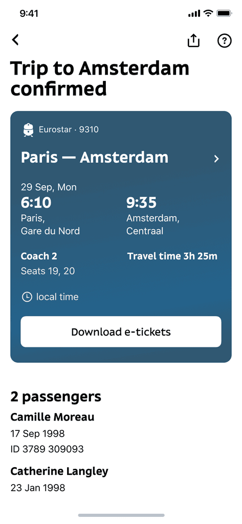
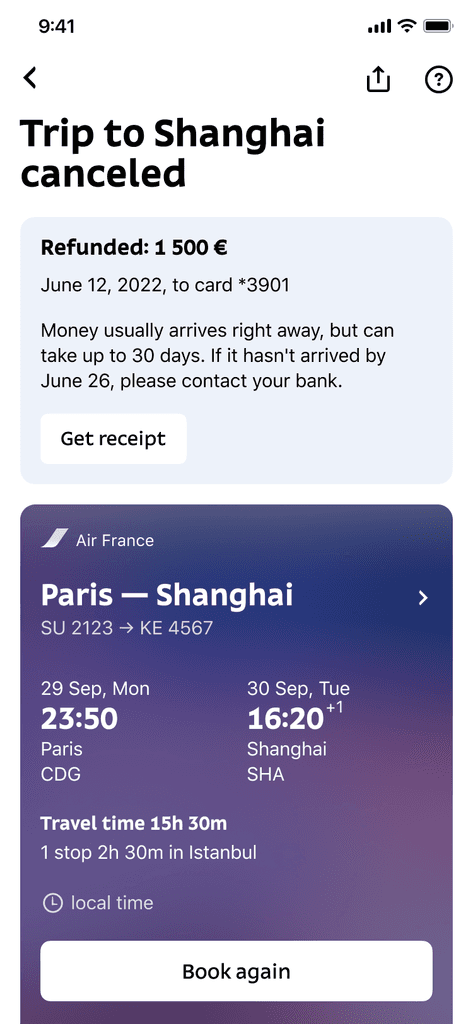
The booking overview card is the most important part of the Order page. The information must be clear, well-structured, and complete. It's also crucial to maintain consistency across all order types—hotel bookings, and airplane, train, and bus tickets.
To validate the data structure and explore visual preferences, I conducted an unmoderated study using the Pathway tool.
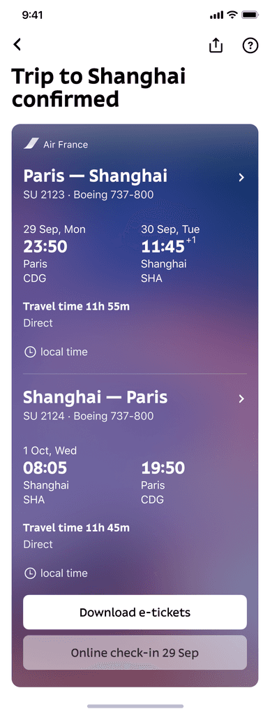
Hotel reservation
Airplane ticket

Train ticket
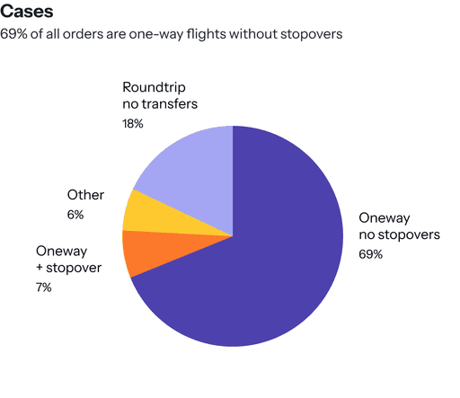
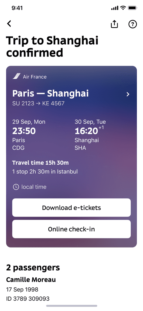
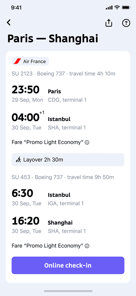
Tutu aggregates flights from different airlines, which means there can be many possible route combinations. To cover all scenarios while keeping the focus on the most common ones, we collected data and found that: the most popular cases are one-way and round trips without stopovers.
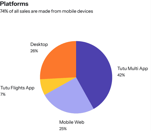
74% of visits were made from mobile devices
88% of bookings are one-way and round trips without stopovers
Based on this information, we decided to keep the booking overview card simple and easy to read, and move the details of complex routes to a separate screen.
Roundtrip
Oneway with stopovers
Complex route details
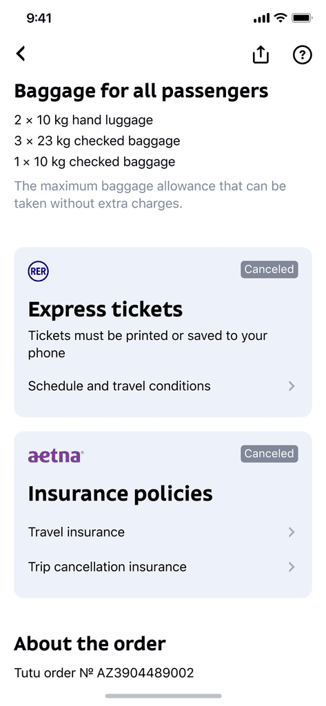
The Order Details page also includes:
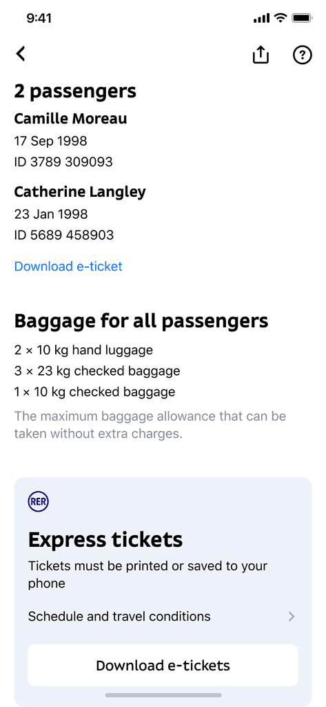
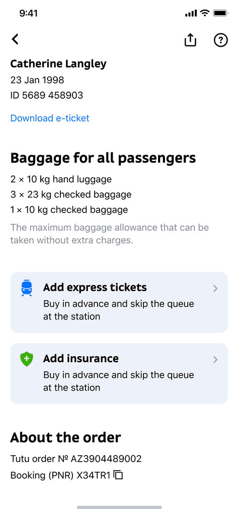
Essential passenger information
Pre-calculated baggage for all passengers
Add-ons such as express tickets and insurance
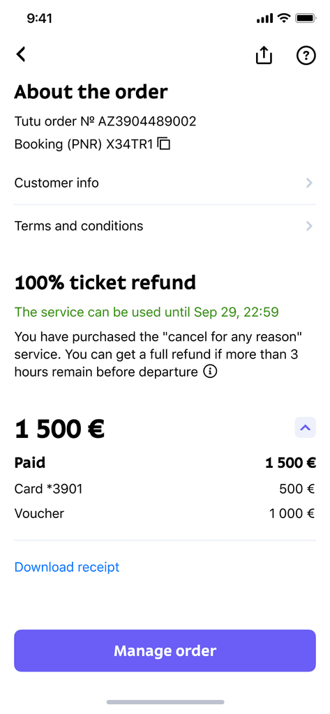
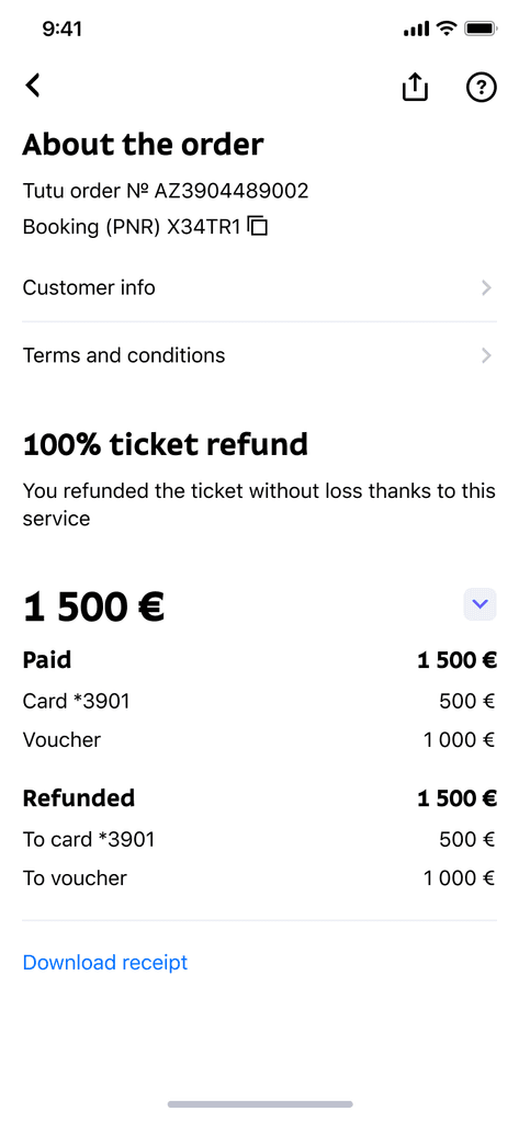
Order details
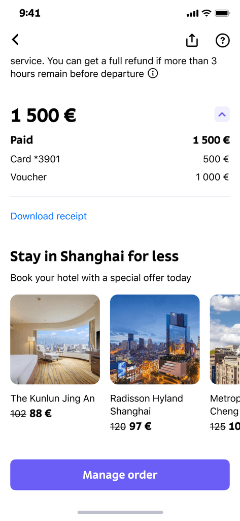
Clear and detailed refund terms
Payment information
Booking overview
Passengers & baggage
Order details & price
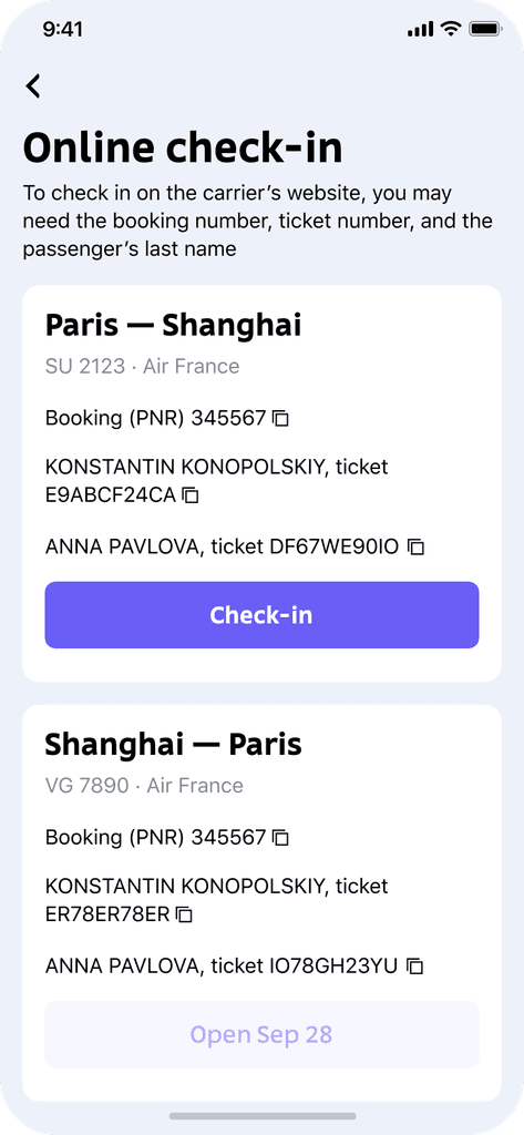
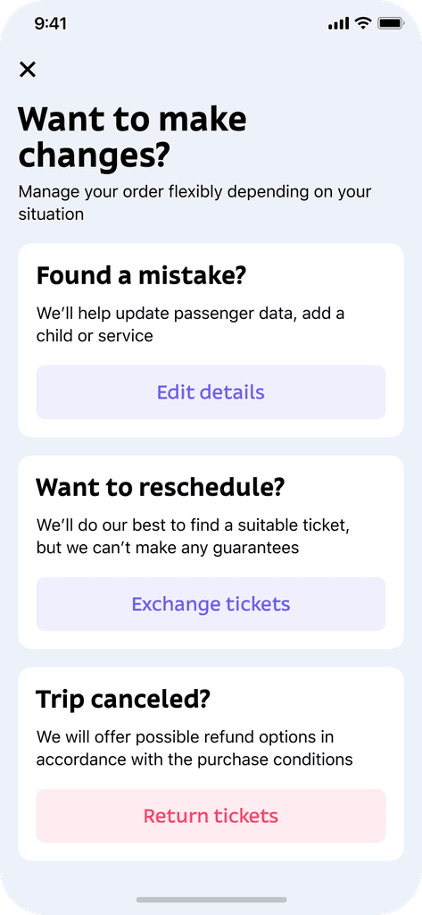
Besides downloading documents, users should also have the ability to register online and modify their orders if needed
Check-in
Manage order
Users can buy trip add-ons like express tickets or insurance at checkout. However, if they skip them, we wanted to provide the option to buy these add-ons on the personal account page.
I added entry points for purchasing express tickets and insurance, shown only if they weren’t included in the original order. Additionally, a cross-sell block promoting hotels was introduced.
Express & insurance
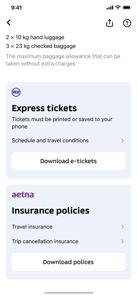
Express & insurance upsell
Hotels cross-sell
Airplane ticket orders have a complex lifecycle with multiple states. By working closely with the system architect, I created a detailed flowchart that covered all possible order statuses.
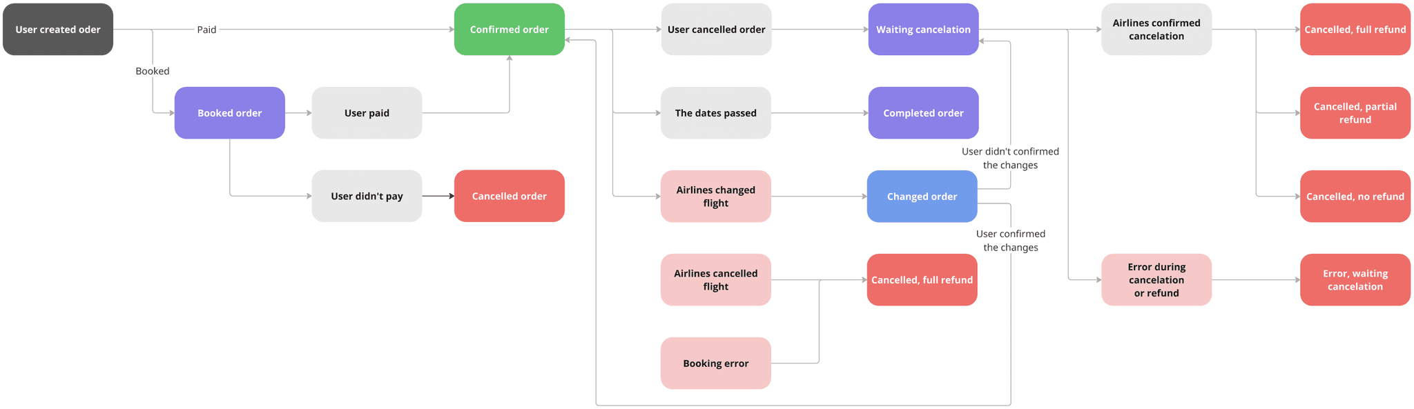
Using this scheme, I carefully designed the Order page for all statuses. Special attention was given to the refund details, as they accounted for a significant portion of support requests
Refund banner
Express & insurance
Payment & refund details
To validate the solution before refining the design, we conducted user testing sessions in collaboration with the research team. We observed how easily users could complete specific tasks. Afterwards, I polished a few confusing elements.
To measure the impact, we ran A/B tests comparing the new design with the original. The results showed:
9% increase in hotel booking cross-sells
17% increase in upsells for express tickets and insurance.
After the full rollout, we also measured the before-and-after effect and found that the number of help desk calls dropped by 23%.
As a technical goal, we aimed to build the new pages using the design system components. I took the initiative to work on most of the components needed for the Order pages, collaborating closely with the design system team.
As a fan of interface icons, I noticed that the Tutu icon pack had several technical issues, such as inconsistencies in shapes, visual weight, and pixel grid alignment. I took the initiative to refine around 250 icons and created structured guidelines for future use.

1.
The new layout, built with the updated design system components, significantly improved both design and development speed
2.
We've got a consistent and precise icon pack of 250 icons, along with clear guidelines for future scaling and maintenance